Another doujinshi review, in the same week? You bet!
Here’s another gem that I got at Comitia.
Okaeri by Hatobue Kurocha and Seta
Okaeri is a collaboration between two artists, whose work comes together to form one book in a way I might have never experienced before. There’s no “writer” or “artist,” as Kurocha and Seta decided to create this book as a “relay” project, alternating both art and writing.
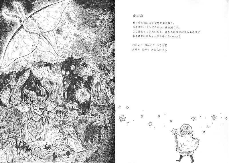
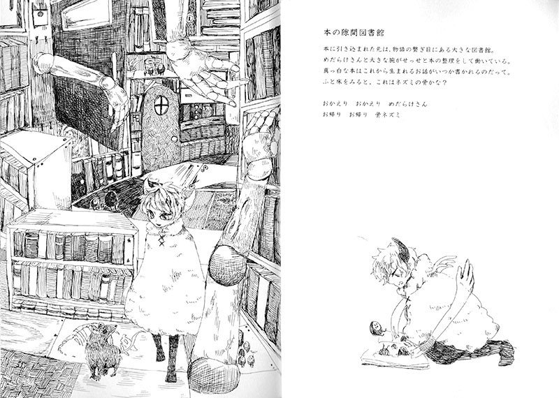
Each double page spread features a full-page illustration with a short block of text, describing a new world the protagonist has stumbled into. The narration always closes with someone being told “okaeri,” and wraps up the scene while introducing a new object or companion that sets the stage for the next.
The Nightly Forest
A gigantic moth paints stars across the dark canopy,
while a Chinese Lantern illuminates the forest, like a lamp.
It is beautiful here, and I see that you have many eyes,
but don’t you think it is a little dark for reading books?
Welcome home, little star.
Let’s return, many-eyed ones.
The star, which is pictured as being returned to its place on the text side of the page, was introduced on the previous page, while the main illustration on this one introduces the many-eyed ones, who create the bridge to the next. The conscious choice of different characters for “okaeri” (おかえり、お帰り) implies that, while being the same word, one of the “companions” is being told to stay in their world, while the other, new one, is being reminded they are out of their natural place, and should head home. It’s a great reminder how versatile the Japanese language is because of its context-sensitivity, and executed beautifully in this case. The title of the book (オカエリ), and the very last page (お還り) offer two more variations of the same word.
The two artists’ styles are quite similar, so much so that I did not notice the “relay” structure at first. They both deliver a highly detailed, textured rendering of the ten highly imaginative realms the protagonist travels, and the illustrations are just a joy to look at. (By now you’ve probably noticed that this style of cross- and parallel-hatched sine pen linework is right up my alley)
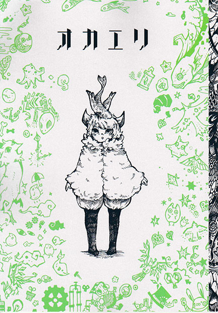
The wraparound cover is another highlight of the book, featuring a selective palette of black and green on shimmering pearl white paper.
Okaeri only has 24 illustrated pages, but due to the one-page-one-world setup it chooses, it offers a lot more content in them than you’d expect. Each page tells its own tale and there is no overarching story beyond the protagonist wandering through them, so readers looking for an epic tale will be disappointed. However, the “relay” structure is really clever and fun, and the last page offers a sense of closure and validation for the protagonist’s journey.
The artists: Seta on Twitter, pixiv, Hatobue Kurocha on Twitter, pixiv
That’s it for today! Hope you enjoyed the read.
In for more? Make sure to check the doujinshi tag for books I have previously reviewed.
As always, I welcome feedback and interaction, so I’d be happy if you liked/reblogged, or even commented. Questions and suggestions are welcome!


