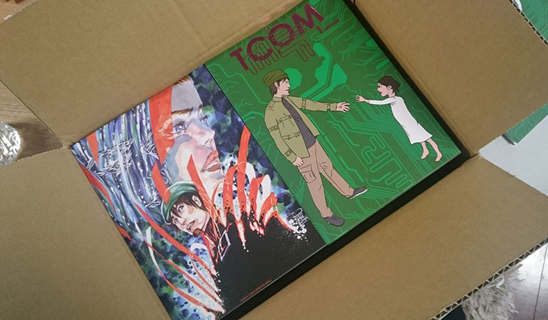
The past month or so, I haven’t made a lot of time to go out, or even for this blog. Instead, I have spent my time living the dream: drawing comics all day in my underwear. Glorious! And today I was rewarded for the work: A box of professionally printed books containing my story arrived at my door!
This post is going to be a recollection of my efforts. I am by no means an experienced artist – this is my first book! – but perhaps people looking into putting their own comics together for the first time might relate, or find some of it helpful.
Edit: Previews!
TCOM, in various forms and stages, has been in the making for the better part of 15 years. Of course, that doesn’t mean I’ve been drawing for 15 years (that would mean I’d drawn a page a year), instead I wrote and rewrote the first chapter, started drawing and scrapped it again, over and over and over again. It’s kinda self-destructive if you think about it. But for some reason, the idea just wouldn’t leave me be, and I knew I wanted to realize it some form, some day.
Initially I started working on TCOM (the pitch for TCOM, more precisely – just like everyone around me I was obsessed with breaking in to the comic industry by getting picked up by an established publisher. At the time I was really into Oni Press) with Hiromi Ueyoshi, a fellow comics fan who was an absolute wizard with a pencil – her old character designs and pages for a minicomic we did just before SDCC 2001 (where she chickened out from saying hi because I looked scary with my eyebrow piercing) still blow me away.
Hiromi was 15? at the time, so it was obviously unrealistic she’d be able to stick with it for long, and I was on my own again. I felt insecure in my abilities as an artist, plus, all comic books I read were made by a writer + an artist. I never really thought about getting it done by myself. I wrote and re-wrote the first chapter at least a dozen times. Never got much farther before I backtracked and restarted.
I’m in a very different place now. I’m 34 years old, with a full-time job, and hardly looking for a “break” into the comics industry. But I do still love comics, and I do still want to make comics.
In recent years, I’ve started attending Comitia, an event where creators known and unknown sell their own original works. Most of them work alone. There’s artists looking to be discovered, but there’s also people just making comics in their free time because they enjoy it, and the level of quality in art varies wildly. I started writing doujinshi reviews on this blog, and made friends with some of the artists. I learned that it’s not hard to get your stuff printed at a reasonable cost. And I realized, there is absolutely no valid reason why I should not be making comics.
I looked at the books I buy and enjoy at Comitia. I noticed I prefer the smaller A5 size, matte covers (often with a pearl finish), and rough paper. I already knew the process of selecting printing properties from producing Philip Tan’s Garan Guard, so I knew I could get these for my book. Paper sizes in most of the world are standardized, A5 is half of A4 etc, and comics are usually scaled down to the next smaller one. So I grabbed some A4 sized Deleter Kent paper (Philip’s recommendation), and started drawing.
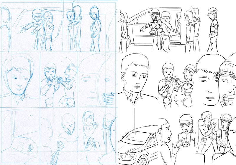
My process is completely non-linear – I had a basic outline of what I wanted to happen in the book, broken down by pages, but I made layout sketches, rough pencils, and the final digitally inked art for each stage at various stages in the process. I had an idea what the characters would say (remember, this book has been in my head for the better part of 15 years),but I didn’t plot out the actual dialogue until after the art was almost completely done, and basically made it up as I lettered. The Marvel way!
I drew all of TCOM in blue pencil, which is something a lot of artists use for their roughs – in my case inconsequential as I didn’t pencil or ink over them. I ended up liking the slick, crayony feel of the colored lead, but it really made no difference. I then scanned them (400dpi for color, 600 for greyscale, as per the printer’s guidelines) and inked over them in Photoshop, using mostly the “Ultimate Inking – Thick & Thin” and “Belgian Comics” brushes from Kyle T. Webster’s “Megapack” brush set. I work on a Wacom Intuos pen tablet, with the grey-tipped kinda rubbery nib on my pen. Ultimately, my choice of inking brush hardly mattered, as I ended up using a very small amount of line weight variation – something I will need to work on.
I think I noticed this too late because I was working in Photoshop, and zooming in a lot.
For the same reason, I also had a hard time keeping the parts of the bodies and faces in proportion. Which is a strong reason to keep doing those pencil roughs, as much as they differ from the finished pictures. I mean sheesh!
A few things I noticed that helped me improve throughout the process:
1 Lock your layers, dummy!
Multiple times, I’d make some adjustments to the layer containing my scanned pencils, and then go back to inking… Only to find I’d been inking on the pencil layer, with no way of separating the lines from the background. It’s just one click to lock a layer in Photoshop (and you can even just lock individual aspects, like position or transparency!), and it’ll prevent mishaps like this with a really annoying dialog box popping up whenever you try to paint on the locked layer.
2 Keyboard shortcuts abound!
I knew most of the basics – hold space to drag, individual letters corresponding to tools, etc. – but I found some new stuff: the tab key hides all the tool bars, leaving the work area free and uncluttered. Shift + tool letters let you access the secondary functions of the tools, like the polygonal or magnetic lassos. In Illustrator, hiding the guards by hitting Ctrl+: sped things up quite a bit.
3 Have a mirror handy!
I learned to have a mirror on my desk. Our rather, I learned why a lot of illustrators and cartoonists do.
For some reason, I never got into the habit of doing this previously. I’ve drawn my share of stuff, nothing professional of course, but never a lot of sequentials. Having a mirror at hand helps a lot with “talking heads” style sequences, which is to say most of this book… Unfortunately I didn’t realize this until halfway through, so the improvement is not as visible as it could be.
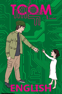
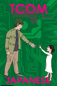
I did the cover very late in the process. I knew this was the face of my book, and I wanted it to look presentable. My art skill was very, very rusty (and had never been particularly good in the first place!), so I decided it was probably wisest to keep it until I felt confident I could do an ok job with it.
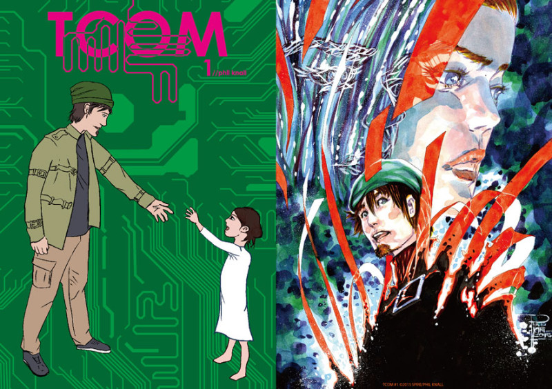
I went for the obvious choice, a picture of TCOM’s protagonists (Tom and Andy).
My initial idea was for them to be on different planes of existence (the real world and the computer world, Matrix if you will), Tom reaching in and his hand dissolving into pixels. I tried to draw this, but every effort I made looked like crap. I chose to stick to the deadline, accept the failure, and try to do a better job next time.
For the background, I came up with the idea of a stylized circuit board rather quickly. I played with a myriad of color combinations – some that stuck were black/pink, yellow/blue, and green/magenta – and decided to keep the green. I also noticed that the pearl finish I enjoy doesn’t really seem right for the subject matter, and thought about alternatives. I noticed the printer I was working with does foil embossing, a technique that was popular (=overdone) in american comics in the 90s. I initially planned to do the entire “circuit” part of the cover in foil, but it was too big for the printer’s standard foil stamp option. So I experimented a little and noticed that the part around the logo type was actually a pretty neat cluster that lent itself well to the foil treatment. The final cover, along with the beautiful back cover Philip did for me, looks like this:
There’s tons of things I would’ve liked to improve. The coloring on the characters, for one, I didn’t have the chance to go beyond flats. I’m not at all satisfied with the girl’s figure. But it was either run with it, or not have the book done in time for SDCC. Sometimes you have to let things go, or risk never to finish the book at all.
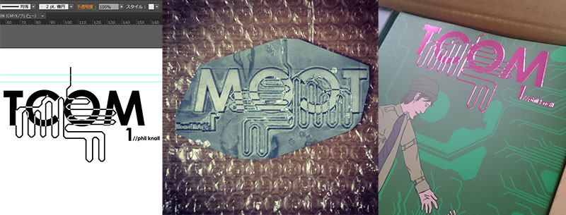
The way the embossing works is, you send the printer an additional file containing the shape for the emboss stamp, in 100% black on one layer. In my case, this was super easy. I’d done the circuit board background in illustrator, so I just put the relevant paths on a new layer, and made sure the outline was as clear as possible. I left the registration- and trim marks the same, so it would be positioned the way I wanted it.
Here’s the illustrator image, the metal stamp the printer was so kind as to send with the books, and the finished product!
I did the layout and lettering in Illustrator (I have a limited design background, so I knew for simple shapes Illustrator always looks best). The printer I used has templates available for both Photoshop and Illustrator, so I didn’t need to fiddle with cut marks and the like. For the actual lettering and panel borders, I found this tutorial from Scott McCloud very helpful (in particular, McCloud’s technique to add an outline to everything on a layer was a lifesaver!)
The result, with a line weight of 2pt for the balloons, and 1pt for panel borders:
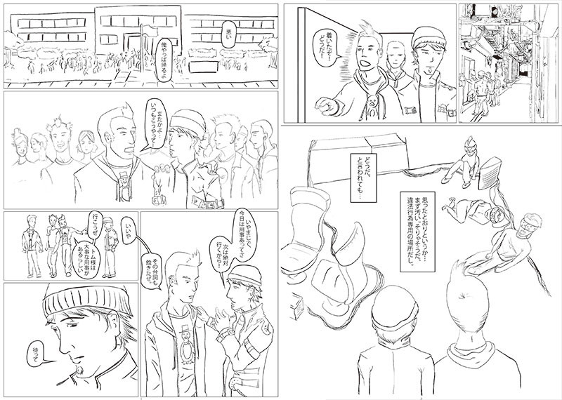
Ugggghhh, lines not extending to panel borders… The more time goes by, the worse I feel about this :/
The printer, as previously, was super helpful in getting everything figured out. I’d met one of their sales managers at Comitia, so I had a direct contact person. That helped heaps, however as I’ve said before, their website has tons of helpful tips on how to prepare the data for print, if you’re able to read Japanese.
I registered and uploaded the files digitally (believe it or not, it’s still quite common for people to send physical originals), and paid per credit card. The printer I chose (Taiyou Shuppan) offers several “set deals” that have a handful of paper- and finish options included at a set price, so that was painless as well. Overall, the entire process was ridiculously foolproof. Including the foil emboss, the semi-transparent cover separators, and shipping, these came down to about $3 each. Not bad.
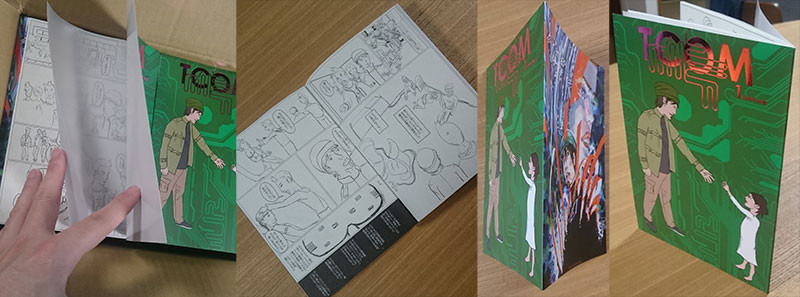
And that’s it! My first minicomic in the can! I only printed it in Japanese, but I’ll do a translation for SDCC on separate copy paper (yikes! only 3 days left!), so I’ll throw a translated PDF up when I’m done! Thanks for sticking with me through this huge post, I hope it offered something entertaining/helpful/new. As always, Likes/comments are very much encouraged!
Click the pictures below to read a 7-page preview of the first issue of TCOM. Let me know what you thought!
